
Project: website redesign
Role: UX researcher / DESIGNER
Tools used: sketch app, inDESIGN

Problem definition & requirements:
This project was part of a 3-website UX and design project that Nowtel tasked us with; the website development would be handled by their in-house team.
Talk Home has three key products (Home, Calling cards, App). Home was initially designed with a calling card approach which evolved to a SIM. It is now positioned as a cheap, no-thrills service, promoting low cost calls challenging its competitors on price. Calling Cards is an international product predominantly used by first generation international customers. App is the latest addition to the brand. The Talk Home brand needs a refresh and a newly designed website for the overall brand and Mobile and Calling Cards sub sites. The target audience for this brand was students and young professionals, between 17 to 50 years old.
User requirements:
Perform a top up
Purchase bundles
Order a free SIM
Perform express checkouts for the above
Register a new SIM / account
Select and view rates
Log into their account and view call history, amend personal details, etc...
Contact Customer Services via email, live chat, social and phone
Choose between SIM, Calling Card and the App
See a presentation of all products with a cohesive experience
Being Calling Cards quite a different product from the others, these will need their own interfaces and layouts
Use a unified cart and checkout system
Sign up and log in with a unique process
New elements to be introduced:
Live Chat feature
Use a unified cart and checkout system
The process
Competitor analysis
UX expert review on the existing website
Interviews with the Customer Service team
Workshop with stakeholders
Persona development
Sitemap
User journeys
Wireframes
Visual design (handled by the Creative team)
1. Competitor analysis
We analysed the websites of 3 competitors to understand key digital trends in the telecommunication industry. Analysing the competition is key in developing an outstanding and differentiated online experience.
2. UX Expert review
A UX expert review was conducted to identify usability issues on the existing website. During the expert review we produced the sitemap of the existing site, in order to get a better understanding of the website’s structure and functionalities.
3. Interviews with the Customer Service team
We spoke to the Customer Service team to understand the users' pain points and the most popular user tasks.
4. Workshop with stakeholders
We ran a workshop with the stakeholders to fully understand the business requirements and share with them the findings of the customer service interviews. The aim of that was to let the stakeholders know what their customers really want from their brand, and not solely focus on the business perspective. Besides, happy customers lead to a happy business ;-)
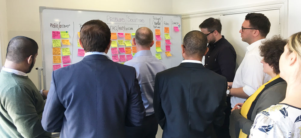
Problems / Solutions for core sections of the website

Sitemap draft created during the workshop
5. Persona development
We developed 4 different personas based on the outcomes from the workshop.

One of the four personas created for this project
6. Sitemap
Having got a good understanding of our users and also the business perspective, we produced a sitemap for the new website.
The sitemap
7. User journeys
We then created user journeys for each of our personas, as well as some more detailed user journeys for the top-up and checkout processes, always taking under consideration our findings from the expert review, the customer service interviews and the workshop with the stakeholders.
User journey for the top up
8. Wireframes
Rapid low fidelity wireframes that led to high fidelity wireframes for the new website.
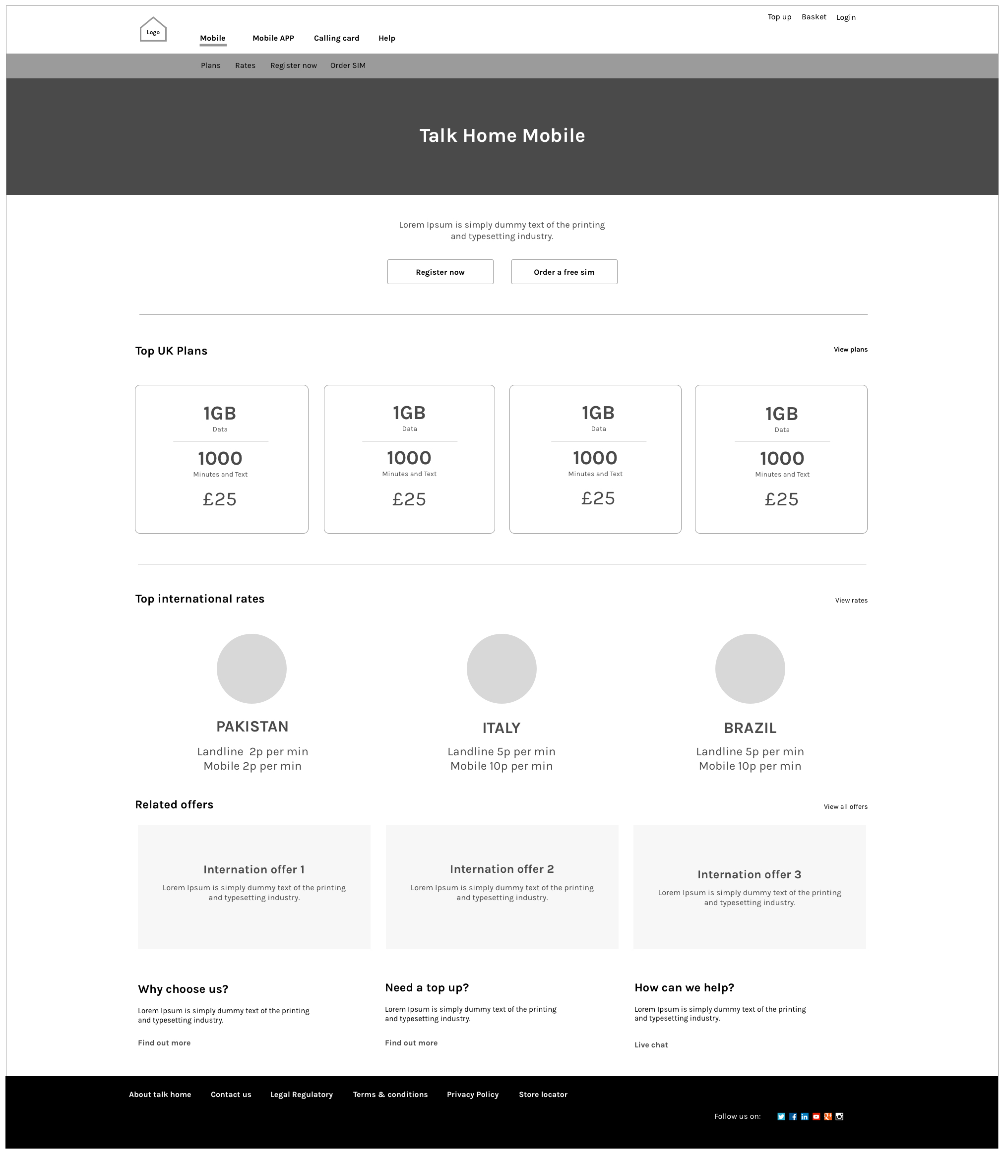
Talk Home Mobile landing page wireframe (desktop)

Talk Home Mobile landing page wireframe (tablet)

Talk Home Mobile landing page wireframe (mobile)

Top up and register form when a users has not registered the product (desktop, mobile)
5. Visual design (handled by the creative team)
During the visual design development, I worked closely with the Design team to ensure the produced designs were aligned with the wireframes and the proposed UX in general.
What could have been done better UX-wise?
1. Usability testing on the existing website.
2. Tree testing to ensure the new structure makes sense to the users.
3. Having the ability to work closely with the developers to ensure the end result was to the desired standards.
What we would like to do next?
1. Usability testing on the new website
2. Re-iterate and optimise the user experience based on the findings of the usability testing. New user journeys, wireframes and designs might be needed, but hopefully not or not much ;-)